What the Dairy Queen Logo Really Means
When summer heat hits hard, there’s one cure that never fails—an icy trip to Dairy Queen. As kids, we’d pile into the car, eyes searching for the red-and-white ellipse that meant sweet relief was near. But that iconic symbol isn’t just a fun shape—it tells a story.
A Logo That Grew With the Brand
Dairy Queen began in 1940 with a simple wordmark: “Dairy Queen” in a plain font. It wasn’t fancy, just a name for great soft-serve ice cream. But as the company grew, the logo evolved to keep up.
By the 1950s, designers introduced the tilted red ellipse. It wasn’t just for style—it gave the logo a sense of motion, reflecting the brand’s quick service and energy.
The Iconic Red Lips
In the 1960s, the logo got a friendlier feel. The clean red oval, often seen as a smiling pair of lips, became the familiar face of Dairy Queen. It was warm, simple, and welcoming—just like the treats it stood for.
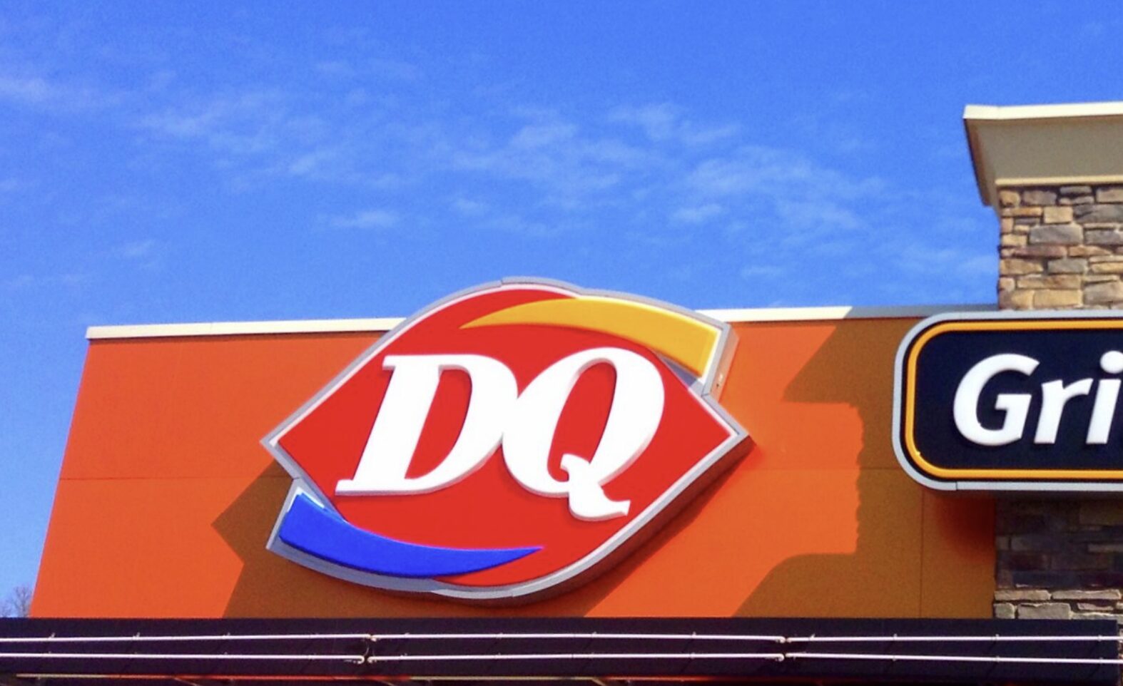
Enter “DQ” and the Hot-Cold Combo
Fast-forward to the 1990s and early 2000s. Dairy Queen updated the logo to match its expanding menu. The name was shortened to “DQ,” and in 2001, swooshes were added: blue for cold treats, orange for hot food. Together, they showed the brand’s dual focus—ice cream and meals.
The Meaning Behind the Colors
-
Red: Symbolizes energy and excitement—the kind you feel on a Dairy Queen run.
-
Blue: Reflects calmness and the refreshing joy of frozen desserts.
-
Orange: Adds vibrance and represents DQ’s hot food offerings.
These elements didn’t just make the logo more modern—they made it meaningful.
A Brand That Stirs Up Memories
Even today, the red ellipse remains. It links generations together—those who remember the old signs and today’s fans of Blizzards and burgers alike. It’s more than a logo. It’s a symbol of summer, family, and over 80 years of happiness.
Next Time You Visit…
As you sip that DQ shake or enjoy a hot meal, take a moment to look at the logo. It’s more than design—it’s a legacy of joy, cleverly wrapped in a smile-shaped ellipse.